
Bringing an Old-School Realtor into the Digital Age
Role
Product Designer
Client
Hector, Real Estate Agent in South Florida
Skills
Responsive Web Design · End-to-End · User Interviews · Persona Development · Affinity Mapping · Wireframing · Usability Testing · Prototyping · Figma
Duration
4 Weeks
Outcome
Users shifted from "I'm not ready to contact him" to "If he's sold in my area, that changes everything" after seeing proof before being asked to reach out
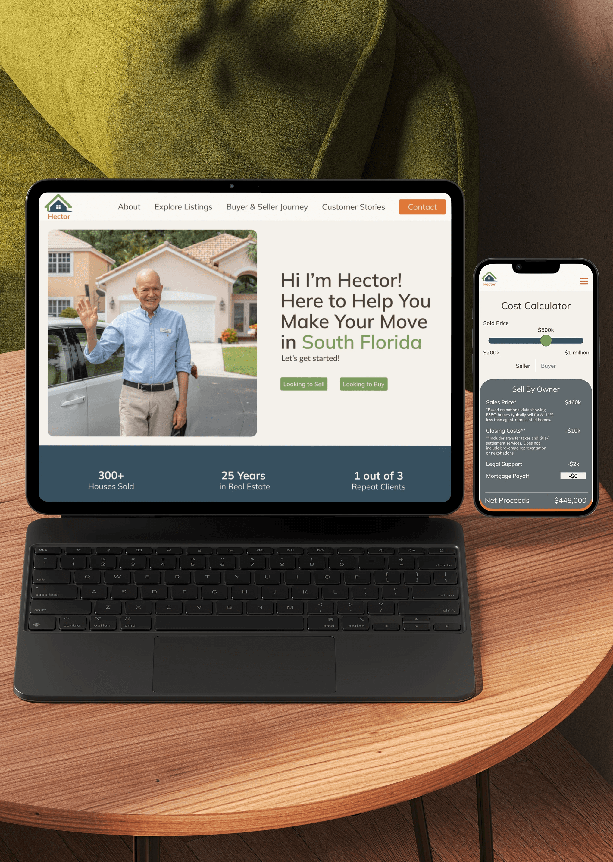
Prototype:
SUMMARY
Hector (the Client), a South Florida real estate agent, built his successful career entirely through in-person connections. His methods worked, but anyone searching online couldn't find him because he didn't exist. The challange was translating what made Hector successful in person, into a digital experience. I designed a website that mirrored his real-world approach (proof, process, personality before contact) and validated it through three rounds of testing. The result: people online could now experience the same trust-building, and Hector saw digital as untapped value rather than unnecessary overhead.
PROBLEM
How can a website deliver the same trust and connection as Hector's face-to-face client relationships?
PROCESS
From User Insights to Tested Prototype Through Three Rounds of Iteration
The design challenge wasn't about flashy features or modern templates. It was about translation: capturing what makes Hector successful face-to-face (his warmth, credibility, personal connection) and recreating that experience online. Rather than push users toward contact forms immediately, I needed to design a digital version of the trust-building Hector does naturally in person.
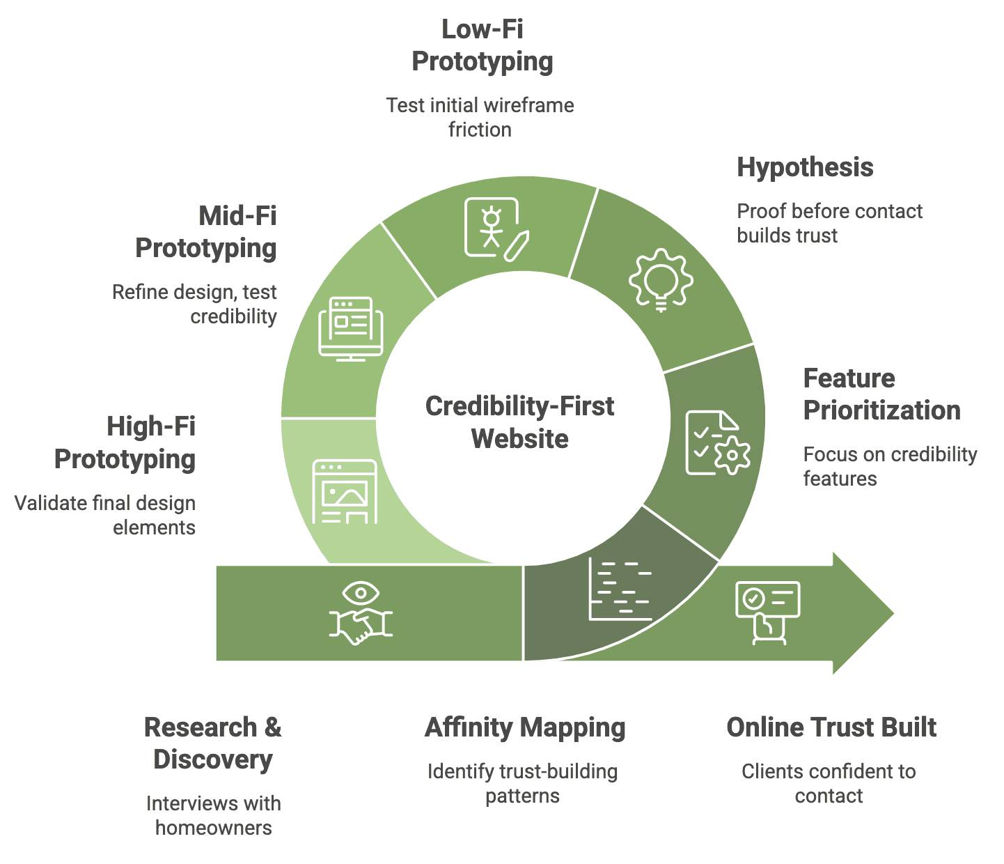
Research
People Wanted Proof Before They'd Even Consider Reaching Out
Through 5 interviews with Hector's past clients and other homeowners, I found trust through credibility and reliability had to come first. Sellers and buyers alike wanted to see proof before they even thought about reaching out: who Hector was, how he worked, testimonials from real people, and most importantly, homes he had actually sold in their neighborhood.
"I have to be 100% comfortable with my realtor, otherwise I'm going to regret hiring them and I definitely don't want that."
-Dwight, moved from Boston, MA to Miami, FL
Common Pain Points
Hypothesis
If Users See Credibility First, They'll Build Trust Organically
Method
Translating Insights Into Design Opportunities
Rather than jump straight into wireframes, I took time to understand where user needs and business needs overlapped.
The center overlap revealed shared priorities: building trust quickly, ensuring smooth transactions, and valuing human relationships over automated systems.
After that, I created user flows to understand how people would interact with the site. These flows helped me identify where trust-building moments needed to happen and where users might drop off if proof came too late.

Affinity Map of people who have bought or sold a home

Working within a critical constraint:
Hector (the client) was unwilling to pay for the MLS (Mulitple Listing Service) integration, MLS is a service that allows users to search any home on the market, regardless of which realtor represented it. This meant I couldn't offer a full home search feature like most real estate sites (Zillow, Realtor.com etc)
Testing
Three Rounds Of Iteration With 5 Home Owners
What users revealed:
It wasn't the need to look at houses in general that built confidence. It was knowing who Hector was, learning about his experience, and seeing houses he represented in the area that people were interested in.
What I changed: I reframed the hero CTA to "Ready to Buy" or "Ready to Sell" for existing clients, rewrote the About section in Hector's voice to highlight his experience, turned the buyer/seller journey into his actual process, and added filters, prices, and context to the Sold Homes section.
Except, The Design Still Wasn't Building Enough Connection
Participants wanted testimonials moved higher on the page (trust first, listings later).
The map confused users when it mixed sold and available homes.
Dwight summed it up: "Am I looking at houses for sale in general, or what he specifically sold?"
SOLUTION
Preview Accuracy With Layout Protection
Based on what three rounds of testing revealed, I refined the design with three focused changes:
Consolidated locking into a single, clear action
Clarified AI entry points with distinct visual cues and labeling
Expanded the preview to show both grid and single-post views across device sizes


Turning the MLS constraint into a strategic advantage:
Without MLS integration, I couldn't show all homes on the market. Instead, I focused exclusively on Hectors inventory: homes he currently represented and homes he'd successfully sold. Rather than positioning him as a generic search portal, the site positioned him as a proven agent with a demonstrated history in their neighborhood. Testing confirmed this approach actually built more trust than a generic listing search would have.
IMPACT
Increase in home sales
Hector saw a clear increase in inbound calls as users spent more time exploring the site and engaging with key content. Instead of immediately looking at listings, users filtered by neighborhood, reviewed sold homes, and spent time building context before taking action.
This shift changed how people reached out because they weren’t just browsing anymore, they were arriving informed and ready to ask specific questions. Those conversations started earlier in the process and felt more intentional, allowing Hector to build trust from the first interaction. The website didn’t replace his reputation — it extended it, giving users the confidence to reach out in the first place.


